pixel rooms!

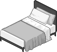
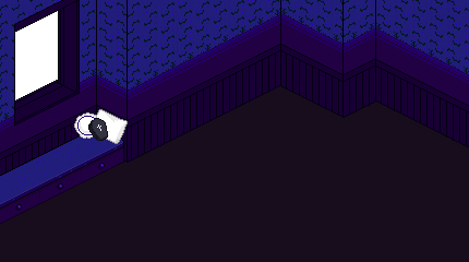
the pixel room that inspired me! i think the artwork is from the cyworld room building feature, but it may also be from this game!
i really love the pixel adoptables and various other graphics i've seen being shared around neocities and the rest of the web, but just putting them together on a page didn't really make me excited. when i was trying to think of ideas for more pages to put on my shrines, i came across some cute old graphics from a couple of old browser games in korea, say club and cyworld, and one of them really stuck out to me (pictured above). i thought it would be cute to use a little room like that as a container for graphics i really like and want to keep, and to have a space (or two, or three, and so on...) on my website to interior-decorate!
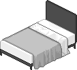
the rooms i've made so far aren't solely my own work - they're sprite edits. i traced a layout and some furniture based on the room in the picture above, and for wallpaper and so on i've been converting textures from games like stardew valley and animal crossing into isometric perspective to use. aside from that, though, i really want to let adoptable pixels shine, so i've elected to try to keep things pretty sparse for the base rooms.
since i wanted everything to be pretty modular, i decided to use the rooms as the background of div containers, and to use relative positioning and the z index to put individual items where i'd like them in the room so that they can function as links back to their sources. in practice I've made some pretty ugly code - i know there's a more elegant way to do it, but with some trial and error i can still position everything where i want it, which is all that really matters, haha.
here's an example of a room with just one piece of furniture clickable (hello märchen, darling!):
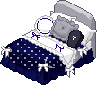


this is what the code looks like.
<div style=" width:430px; height:240px; background-image:url('/meru/room_a/maer room.png'); background-size:cover; overflow: hidden;">
<a href="https://graphic.neocities.org/furniture"><img src='/meru/room_a/bed.png' style="z-index:3; position:relative; top:20px; left:85px; "></a>
<img src='/meru/room_a/window.gif' style="z-index:1; position:relative; top:0px; left:-220px;">
<img src='/meru/room_a/maer room.png' style="z-index:2; position:relative; top:-130px; left:0px;">
<img src='/img/merusquish.gif' width="80px" style="z-index:5; position:relative; top:-250px; left:167px;">
"wow, lestat, that's fucking unreadable!" Sorry 💖
i set the container to be the same size as the background image to make my life easier. this is a very ridiculous thing i did, but i put the gif i wanted outside the window on top and then layered the background image on there again in the exact same position to create the illusion of a cohesive animated background. i also did this in my emet-selch shrine in order to keep the bubble script i had on the page from flowing over the room but underneath the furniture, since it doesn't play nicely with z-indexing. this is the part that's kind of dumb and inelegant, but if it works it works.
anyway, aside from that it's pretty straightforward. i positioned everything where i wanted it, and set my märchen gif to be a smaller size so he wouldn't obstruct too much space in the room. i also gave him a z index that was higher than strictly necessary just for peace of mind.
adding in new images isn't too hard, but they have to be put in AFTER the old ones, if i'm remembering correctly. for whatever reason putting a bunch of items with relative positioning in the same div makes them not want to play nicely (probably something about me being bad at html), and i fucked everything up trying to add stuff to emet's room at one point. adding line breaks prevents that, but elements get pushed waaay far downward for some reason? in any case, it's no big deal to reposition stuff if it gets knocked out of place, it's just fucking annoying.
after writing this page i went on adding more stuff to my rooms and noticed i'd really made a mistake with my code. overflow is set to visible by default, which i didn't know, so adding stuff after a certain point made the page keep getting longer and longer. setting it to hidden fixed that. i'm still not sure why some pictures show up so far down on the page, though.
great explanation! show me how to make one.
i'm glad you asked! If you didn't ask, too bad!

this is a color-coded version of the template i use to make the rooms. feel free to swipe it and do whatever you want to it! it'd be cool if you linked back to this page so other people could use it if they're interested, but it's not a requirement.
this is a guide to isometric pixel art. it's useful if you want to repurpose textures or draw your own furniture to go in your room. give it a read!
this archived game has lots of furniture and props to choose from!
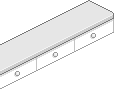
finally, here's some of the furniture from the original room i fiddled with. in the future i'd like to draw my own furniture and add it to the site as adoptables for other people's rooms (or whatever else they'd like to use it for).